Definition and Use of Scatter Plots
Sometimes the relation between two quantities isn't a straight line nor can it be represented with a smooth curve but
the data plot is scattered. Such data plots are usually obtained for scientific observations as a result of experiments.
It doesn't give us an exact equation between two quantities but helps us to formulate the correlation between the two
quantities. We approximate the relation between two quantities with a line that best fits the data plot.
Scatter plots are used for predicting or estimating the value of a dependent quantity for a given value of an independent
quantity. This is done by assuming that for the future or unknown values, the relation between the two
quantities represented by the best fit line will remain the same.
This will be clearer from the scatter plot shown below between number of hours of study(x) and score obtained in final exam (y).
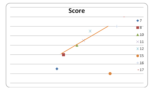
Number of study hours |
Score (%) |
7 |
79 |
8 |
82 |
10 |
84 |
11 |
85 |
12 |
87 |
15 |
78 |
16 |
88 |
17 |
90 |
To find the equation of the best fit line, we consider those points that form a line. The line should be selected in such
a way that it passes through most of the points in the scatter plot. For the given data we can choose (8, 82) and (17,
90). Since we do not get an accurate line, the equation of the line is only an estimate.
The slope of this line = 8/9 = .9 ≈ 1
Equation of the line = (y-82) = .9(x- 8) or y = .9x + 74.8
Interpretation of a Scatter Plot
From the scatter plot given above, we can find out the pattern between number of study hours and the student's
score. Since the slope of the line is positive i.e. the value of y (score) increases with increase in x (I.e. study hours)
the relation between y and x is a positive correlation.
Correlation can be of four types
-
Positive correlation : The value of the dependent quantity increases with the increase in value of the
independent quantity. The slope of the line representing this correlation is positive.
-
Negative correlation: The value of the dependent quantity decreases with the increase in value of the independent quantity. The slope of the line representing this correlation is negative.
-
Highly negative correlation: A negative correlation with most of the data points lying on the best-fit line.
-
Highly positive correlation: A positive correlation with most of the data points lying on the best-fit line.
-
No correlation: When the scatter plot doesn't show a particular trend; i.e. neither positive nor negative
correlation, there is no correlation between the two quantities.
The scatter plot shown above has "positive correlation". A positive correlation doesn't mean that if a student studies
for more hours than others then he will score higher than others but it means that the student has a higher chance
of scoring higher than others based on the trend observed for other students. The accuracy of conclusion from a
scatter plot depends on the number of observations (x values) taken and also the source of observation.
Predicting Values
Once we know the equation of the line, we can use it to predict values. For the above scatter plot with the equation
of the line as; y= .9x + 74.8 means that if the student doesn't study at all, he will score about 75 % from school
lessons only. This may not necessarily be true because it actually depends on various other factors like the
student's IQ, intelligence, understanding of subject etc. This data would make sense only if the students
with similar IQ, intelligence and understanding are surveyed.
We can predict the score if he studies for 4 hours as: y = .9 x 4 + 74.8 = 78.4 %
Try these questions
-
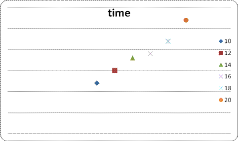
Peter is training for a mile swim. The first week, the best time for each of them was 80 minutes. Then Peter
had a best time of 75 minutes for the second week. A best time of 76 minutes in the third week, 71, the
fourth week, 72 the fifth week. At the end of the eighth week, what would have been the best time for Peter?
-
65 minutes
63 minutes
-
70 minutes
-
1 hour
Answer: B
For the scatter plot shown below, answer questions 2-3:
-
The scatter plot is a
-
Positive correlation
Negative correlation
-
Highly positive correlation
-
Highly negative correlation
Answer: C
The equation of the best fit line is
-
y=1.5x – 3
y=3x -3
-
y = 1.5x +3
-
Hy = x -3
Answer: A