Pictorial Representation of Statistical Data
A dataset containing two variables is called bivariate data. Bivariate data shows the relationship between two variables.
- Dependent variable :
This variable depends on the independent variable. It is also known as the measured variable.
- Independent variable :
This variable does not depend on any variable, but alters the dependent data when changed. It is also known as the control parameter.
Scatter plots show the relationship between two variables by means of a simple point (data point) in the graph; they are the graphical representation of bivariate data
Scatter plots consist of two axes. The independent variable in the plot is called the control variable and the dependent variable is called the measured variable.
Example:
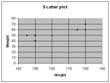
In a class, let us tabulate the weights of 7 students with respect to their heights.
| Student No |
Height (cm) |
Weight (kg) |
1 |
150 |
40 |
2 |
145 |
50 |
3 |
160 |
50 |
4 |
175 |
60 |
5 |
150 |
50 |
6 |
180 |
60 |
7 |
180 |
70 |
Now let us draw the scatter plot for the above data.
A scatter plot helps to determine if a relationship exists between the two variables. To do this we can follow a number of steps:
- Draw a line that best fit through the data points, the line should be drawn in such a way that there is the same number of points above and below the line, and the line goes through the middle of the set.
- Determine the correlation between the two variables, whether it is strong, mediocre or weak.
- Determine if the correlation between the two variables is positive or negative. Positive correlation means that as the value of one variable increases so does the other; negative correlation indicates that as the value of one variable increases, the value of the other decreases.
- Make a statement regarding the strength and direction of the correlation, and the reasons if any for that correlation.
Using the above example, we can follow the steps outlined.
The line drawn through the data points show equal numbers of points above and below the line and it goes through the middle of the set. However, take note that it cannot be considered THE line that fits best, since many of the data points are a long way from the line.

The line shown below is better, since all the data points are as close to the line as possible.

Since all the data points are close to the line, we can say that there is a strong correlation between the data sets.
Also, since the line is sloping upward, we can say that the relationship is positive; that is as one increases, the other increases too.
Therefore, we can state that there is a strong positive correlation between the height and weight of students.
This is to be expected because generally, the taller someone is, the more they weigh. However, this is not always the case because the line is not a perfect fit.
Now let us look at another data set
Average daily temperature, Celsius |
Average rainfall, mm |
10 |
250 |
15 |
200 |
20 |
140 |
25 |
70 |
30 |
60 |
35 |
130 |
40 |
90 |
The scatter plot and line for the data is shown below
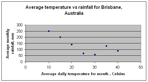
It can be seen that many of the data points are quite some distance from the line, which is also sloping downwards. This relationship is mediocre-negative, indicating that sometimes as the temperature increases, rainfall decreases. This is not always the case, since when the temperature gets too high, the chance of thunderstorms and rain increases in this part of the world.
When interpreting scatter graphs, it is important to apply common sense to the results. The following example illustrates this point.
Consider the following data which shows the average number of forest fires in Australia per month and the average the number of snowy days in Alaska per month
| Month |
Number of bushfires per month in Australia |
Number of snowy days in Alaska per month
(over certain amount) |
Jan |
120 |
25 |
Feb |
150 |
23 |
Mar |
120 |
18 |
Apr |
100 |
11 |
May |
70 |
5 |
Jun |
50 |
3 |
Jul |
25 |
3 |
Aug |
40 |
6 |
Sept |
45 |
9 |
Oct |
60 |
16 |
Nov |
75 |
20 |
Dec |
85 |
21 |
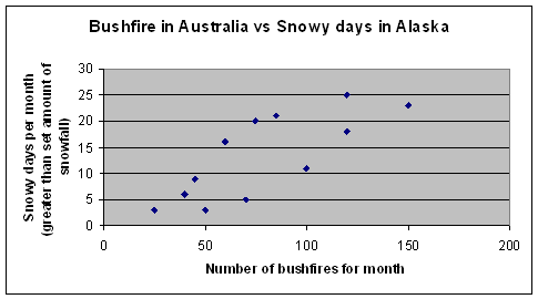
The correlation can be described as mediocre/strong positive. Does this mean that snowy days in Alaska are caused by bushfires in Australia? Of course not; there is a correlation, but it is between each set of data and a third set, that is the season that each area is in. When it is hot in Australia there is a greater chance of bushfires; when it is summer in Australia it is winter in Alaska, therefore there is a greater chance of snow. Both data sets are correlated to a third set and not to each other.
This is only one example of potential pitfalls in scatter plot analysis; the conclusions of which need to be carefully considered.
Try these questions :
- The scatter plot for the following table showing the marks of 8 students in the internal and external examinations is
Student Name |
Marks in Internal Exam
(Out of 25) |
Marks in External Examination
(Out of 100) |
Robert |
24 |
89 |
John |
23 |
90 |
Mark |
24 |
87 |
Ashton |
20 |
85 |
Tom |
21 |
85 |
Mike |
19 |
86 |
Adam |
15 |
75 |
Peter |
20 |
84 |
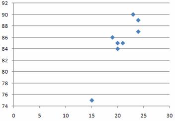
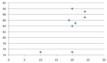
Plot each point to attain the correct answer.
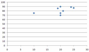
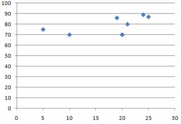
- Which of the following scatter graphs shows a negative weak correlation?
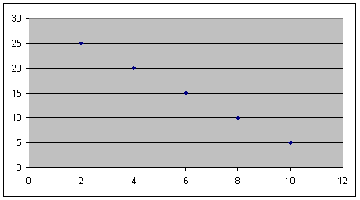
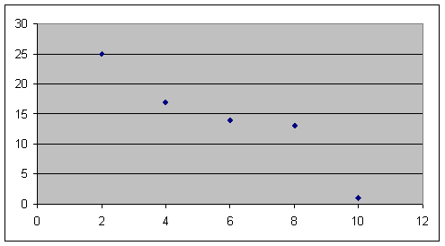
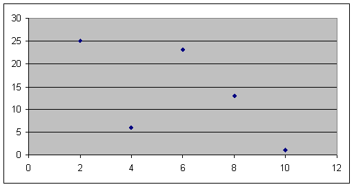
A is a positive relationship, b shows a perfect negative relationship, whilst c shows a strong negative relationship. D is correct since a drawn line will still leave data points at some distance away.
- Which of the following scatter graph relationships indicate that as one variable increases the other is likely to increase?
- Medicre
- Strong
- Positive
- Negative
Answer: C
A negative graph would show the opposite relationship, whilst strong or medicre could be either positive or negative.