Histogram
Histograms also show the relative frequency of events similar to a bar graph. However, the major difference between the two is that a histogram graphs continuous data; that is data which is not separated into discrete units, but is representative of a range of values.
Consider weighing a group of pebbles found on a beach. Each pebble if measured accurately enough will have a different weight compared to every other pebble. Note that even for 7 pebbles, a bar chart will not be able to show much information.
Weight of pebble (grams) |
Number of pebbles with that weight |
250 |
1 |
254 |
1 |
261 |
1 |
265 |
1 |
266 |
1 |
268 |
1 |
400 |
1 |
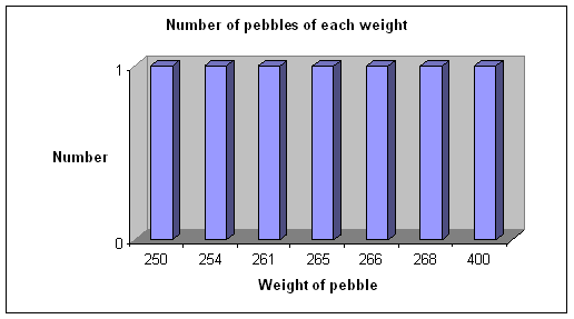
There are two problems with the above chart
- It doesn’t really give any useful information
- The weight axis is not scaled, so there is no visual information as to the range of sizes (400 is as far from 268 as 268 is from 266)
- If there were a lot of pebbles to be weighed and recorded the chart would be very large and still show no useful information.
To overcome these problems, the data is arranged into groups of equal size. The method of choosing the range of each group and how many groups there are is a matter to be discussed in another lesson; suffice at this stage to realize that the data could be represented more meaningfully in this way.
For example, we can arrange the weights into the following groups
Groups of weight of pebble (grams) |
Number of pebbles whose weight was in that range |
250-255 |
2 |
255-260 |
0 |
260-265 |
1 |
265-270 |
3 |
400-405 |
1 |
Note that the size of each group is the same (5 grams), and be aware that the upper end of each group does not include the highest value as part of that group (for example, a pebble weighing 265 grams would be in the 265-270 group, not the 260-265 group, and definitely not both!).
The histogram would now appear in a form that conveys more meaningful information.
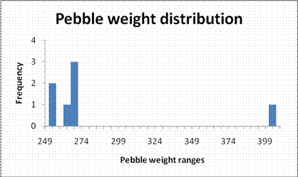
Granted the new bar chart isn’t a great improvement of the original, but that is mainly because there is not a great amount of data. The strength of the histogram lies in its ability to represent a very large group of varied data.
Note that:
- The bars represent a range of data; for example the largest bar represents all weights in the 265 to 270 gram range
- Each mark on the axis represents the highest number of each range; for example the mark under the largest bar represents the number 269 (the difference between each mark is 5 grams)
- There is no gap between each bar, since the data is continuous; all possible weights could be any number in the range up to whatever level of precision is required
- The x axis is scaled appropriately
- The one weight that is different from the rest is shown on the graph. It is distinct and can be seen easily as outside the majority of the weights. Such a data point is called an outlier
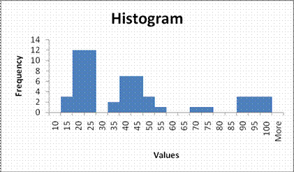
Consider trying to produce a bar chart of the following data
11, 12, 13, 16, 16.5, 17.1, 17.3, 18.1, 18.2, 18.7, 18.7, 19, 19.2, 19.4, 19.9, 20.01, 20.1, 20.9, 21, 21.34, 22, 22.4,22.7, 22.75, 23.1, 23.2, 24.2, 30.3, 30.35, 35.4, 36, 36.6, 37.8, 38, 38.2, 40.9, 42.1, 42.2, 42.4, 42.6, 44, 45.55, 46.1, 48, 54.45, 66, 72.4, 86, 87, 89, 92, 92.5, 92.9, 97, 99.8, 99.9
Organizing the data into groups and producing a histogram produces a more suitable chart
Try these questions
- Which number in the following data set is an outlier?
1, 99, 100, 102, 103.6
- 1
- 103.6
- 100
- There are no outliers
Answer: A
An outlier is a number which does not belong with the other data in the set; hence 1 is an outlier in this case.